

_page-0008")
_page-0009")
_page-0010")
_page-0011")
_page-0015")
_page-0016")
_page-0017")
_page-0018")
_page-0019")
_page-0020")
_page-0021")
_page-0022")
_page-0023")
Our Contribution:
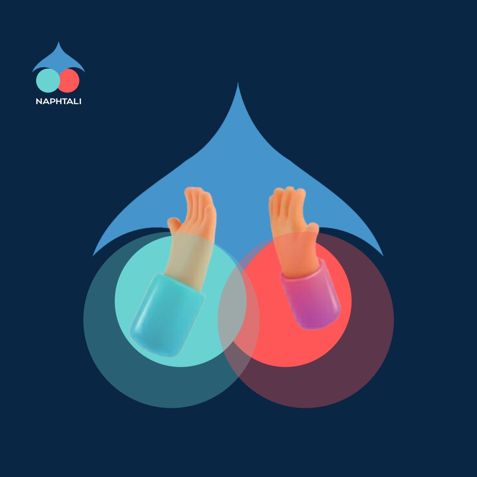
Amphin partnered with Naphtali to develop a comprehensive branding and visual identity strategy. We designed a logo that embodies the brand’s core values with a simple yet impactful abstract design. The logo features a dove illustration representing peace and restorative power, while the different colored circles symbolize the coming together of opposing parties, showcasing unity in diversity. The convergence of these shapes reflects themes of reconciliation, unity, and bonding, effectively communicating the brand’s mission.

Results of the project
Create ideas
We developed a unique, abstract logo for Naphtali, using creative design concepts that captured the essence of the brand’s mission—unity, reconciliation, and growth. The design was inspired by the brand’s values, combining symbolic shapes and colors to create a visual identity that resonated with its audience.
Support clients
Throughout the branding process, we worked closely with Naphtali to understand their vision, providing consistent support and adapting our designs to reflect their goals. Our collaborative approach ensured that the final outcome aligned with their desire to foster healing and stronger connections.
The best development
The visual identity we created strengthened Naphtali’s market positioning, reflecting their core message of love and unity. Our focus on high-quality design helped enhance their appeal, enabling the brand to stand out while staying true to its values of peace and reconciliation.
Solve problems
Naphtali faced challenges in visually expressing their core values. Our abstract logo, with its thoughtful symbolism of peace, unity, and new beginnings, provided an elegant solution. By bridging the gap between concept and design, we helped them communicate their mission of healing and restoration more effectively to their audience.