

In the fiercely competitive landscape of modern branding, a logo serves as the visual cornerstone of a company’s identity, acting as a silent ambassador that communicates its values, personality, and aspirations. Yet, the true power of a logo transcends mere visual appeal; it resides in its ability to evoke emotional responses and forge lasting connections. At the heart of this emotional resonance lies the profound influence of color. Colors are not simply decorative elements; they are potent psychological triggers, capable of shaping perceptions, influencing purchasing decisions, and fostering brand loyalty. From the serene tranquility of blues to the energetic vibrancy of reds, each hue carries a unique set of associations, capable of subtly or dramatically altering how a brand is perceived.
Understanding and harnessing the psychological impact of color is therefore paramount for any brand seeking to establish a memorable and meaningful presence in the marketplace. This article delves into the intricate world of color psychology, exploring how strategic color choices can elevate logo design from a mere visual representation to a powerful tool for brand communication.
Why Color Psychology Matters in Logo Design
The strategic application of color psychology is particularly crucial in logo design because a logo’s concise visual nature leaves little room for ambiguity. A well-chosen color palette can instantly convey a brand’s core values and target audience, while a poorly selected one can lead to misinterpretations and missed opportunities. Statistically, certain color preferences dominate the branding landscape.
For instance, blue is consistently favored by technology and finance companies (think IBM, PayPal, and Visa) due to its association with trust, security, and reliability. Red, associated with energy and excitement, is prevalent in the food and beverage industry (Coca-Cola, McDonald’s) and sports brands. Green, symbolizing growth and nature, is favored by eco-conscious brands and health-related companies (Whole Foods, Starbucks). Yellow, conveying optimism and warmth, is often used by brands seeking to project a friendly and approachable image (IKEA, Snapchat). Black, representing sophistication and luxury, is chosen by high-end brands (Chanel, Gucci).
Data analysis shows that approximately 33% of the world’s top 100 brands use blue in their logos, while around 29% use red. This reflects the deep-seated psychological associations these colors evoke.
In logo design, color is not merely a matter of aesthetic preference; it’s a strategic tool that, when wielded effectively, can establish a powerful emotional connection with the target audience, driving brand recognition and fostering lasting loyalty.
Red Logos
Red is the color of intensity, passion, and urgency. It has a profound psychological impact, triggering strong emotional responses such as excitement, love, and even aggression. This powerful color is associated with increased heart rate, appetite stimulation, and action-oriented behavior. Its high visibility makes it ideal for capturing attention instantly, which is why it’s often used in warning signs, sales promotions, and entertainment branding.
Red’s evolutionary significance is deeply ingrained in human perception. It was crucial for early humans in identifying ripe fruits and potential dangers, which explains why it continues to demand our attention. Psychologists note that red can increase energy levels and create a sense of urgency, making it highly effective for call-to-action buttons and marketing campaigns.
Brands like Coca-Cola, Netflix, YouTube, KFC, and Red Bull use red to evoke excitement and energy. Coca-Cola’s iconic red branding associates the brand with liveliness and joy. Netflix’s red logo symbolizes passion for entertainment, while YouTube’s red play button creates an instinctive urge to click. In the food and beverage industry, McDonald‘s, KFC, and Pizza Hut utilize red to stimulate appetite and encourage fast decision-making.
Red is particularly effective for industries that thrive on impulsivity, energy, and attraction. Whether it’s the urgency of a SALE sign or the passion behind Levi’s branding, red is an undeniable powerhouse in the world of logos.
Blue Logos
Blue is universally associated with trust, stability, and intelligence. It’s one of the most calming colors in the spectrum, linked to feelings of security and reliability. Its prevalence in nature—seen in the sky and oceans—makes it feel familiar and reassuring. Psychologists suggest that blue lowers stress and promotes a sense of order, which is why it’s often used by financial, healthcare, and technology brands.
Unlike red, which triggers urgency, blue fosters rational decision-making. Studies indicate that blue enhances concentration and productivity, making it a favorite for corporate brands. It also conveys intelligence and innovation, reinforcing its popularity among tech companies.
Brands like IBM, Facebook, PayPal, Ford, and Samsung use blue to project trustworthiness and competence. Facebook’s blue branding reflects its goal of building social connections in a secure space. PayPal and American Express leverage blue’s association with financial reliability, while Ford uses it to establish a sense of durability and heritage. In the healthcare industry, companies like Pfizer and GE Healthcare rely on blue to inspire confidence in their products.
Blue is an excellent choice for brands that want to instill a sense of dependability and long-term value. Whether it’s LinkedIn representing professional networking or Dell symbolizing technological stability, blue logos offer a timeless appeal.
Yellow Logos
Yellow exudes warmth, happiness, and optimism. It’s the color of sunshine, radiating positivity and energy. Yellow is known to stimulate mental activity, creativity, and even metabolism, making it an effective choice for brands that want to appear friendly and inviting.
Psychologists note that yellow increases serotonin production, boosting feelings of joy and enthusiasm. However, excessive yellow can cause anxiety, which is why it’s often used in combination with other colors. Its high visibility makes it perfect for brands that want to stand out, whether in signage, packaging, or digital branding.
Brands like McDonald’s, Snapchat, IKEA, Nikon, and Ferrari use yellow to evoke feelings of cheerfulness and innovation. McDonald’s golden arches create a welcoming and playful brand identity. Snapchat’s yellow branding reflects fun and spontaneity, while IKEA’s combination of yellow and blue represents affordability and reliability. Ferrari’s yellow shield, complemented by a prancing horse, adds a touch of luxury and speed.
Yellow is commonly used in industries that prioritize energy, communication, and youthfulness. Whether it’s National Geographic’s iconic yellow frame representing curiosity or Subway’s yellow logo symbolizing fresh and fast food, this color commands attention in a unique and engaging way.
Green Logos
Green represents nature, growth, and sustainability. It’s a color deeply associated with balance, health, and renewal. Psychologically, green has a calming and reassuring effect, making it a popular choice for eco-friendly brands, wellness industries, and financial institutions. It signifies harmony and prosperity, often evoking a sense of security and trust.
Research shows that green is one of the easiest colors on the eyes, promoting relaxation and reducing stress. It’s often linked to feelings of abundance and fresh beginnings, which is why it is frequently used in agricultural, health, and environmental branding. It’s also associated with wealth, making it a strategic choice for financial services.
Brands like Starbucks, Whole Foods, John Deere, Land Rover, and Animal Planet use green to communicate sustainability, health, and connection to nature. Starbucks’ green siren represents a welcoming, rejuvenating coffee experience. Whole Foods’ green branding reinforces its commitment to organic and natural products. John Deere and Land Rover both use green to highlight their connection to nature and durability. WhatsApp’s green logo conveys reliability and ease of communication.
Green is the go-to color for brands that want to establish a sense of well-being, trust, and environmental responsibility. Whether it’s Heineken using green to symbolize freshness or Spotify linking it to creativity and growth, this color has a strong subconscious impact.
Orange Logos
Orange is the color of enthusiasm, creativity, and friendliness. It combines the warmth of red and the cheerfulness of yellow, creating an energetic and playful impression. Psychologically, orange is associated with confidence, motivation, and sociability. It’s often used to encourage excitement and adventure, making it a great fit for entertainment, food, and fitness brands.
Orange is also linked to affordability and accessibility. Studies suggest that it stimulates appetite and conversation, which is why many restaurants and food brands incorporate it into their branding. It also represents innovation, making it a favorite for tech and startup companies.
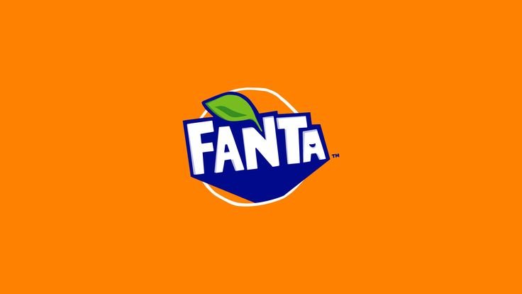
Brands like Fanta, Nickelodeon, Harley-Davidson, Amazon, and JBL use orange to convey fun and boldness. Fanta’s vibrant orange branding reflects its fruity and energetic appeal. Nickelodeon’s playful orange splash reinforces creativity and entertainment. Harley-Davidson uses orange to symbolize adventure and freedom, while Amazon’s orange arrow subtly conveys happiness and movement from A to Z. JBL leverages orange to stand out in the tech and audio industry.
Orange works best for brands that want to appear approachable, exciting, and dynamic. Whether it’s Gulf Oil’s strong presence in motorsports or Dunkin’ Donuts using orange to stimulate energy in its coffee branding, this color is undeniably powerful.
Purple Logos
Purple symbolizes luxury, wisdom, and creativity. Historically associated with royalty, it exudes sophistication and exclusivity. Psychologically, purple is linked to imagination, spirituality, and deep thinking, making it a strong choice for beauty, technology, and high-end brands.
Purple is often seen as a color of mystery and innovation. Lighter shades like lavender convey femininity and calmness, while deeper purples evoke luxury and prestige. Studies suggest that purple can also stimulate problem-solving abilities and artistic expression.
Brands like Cadbury, Hallmark, Yahoo, Twitch, and FedEx use purple to create an elegant and distinctive brand identity. Cadbury’s rich purple branding reinforces its premium chocolate heritage. Hallmark’s purple crown represents quality and sentimental value. Twitch uses purple to symbolize creativity and self-expression within gaming communities. FedEx’s combination of purple and orange blends trust with efficiency.
Purple is often chosen by brands that want to stand out with a touch of sophistication and uniqueness. Whether it’s NYU’s academic excellence or Crown Royal’s regal branding, purple remains a color of prestige and innovation.
Pink Logos
Pink symbolizes femininity, playfulness, and romance. It evokes feelings of warmth, kindness, and creativity. Lighter pinks represent innocence and calmness, while bold pinks convey energy and excitement.
Psychologically, pink is associated with positivity and nurturing. It’s often used in beauty, fashion, and lifestyle brands targeting a youthful and energetic audience. Studies show that pink can have a soothing effect, making it ideal for wellness and self-care branding.
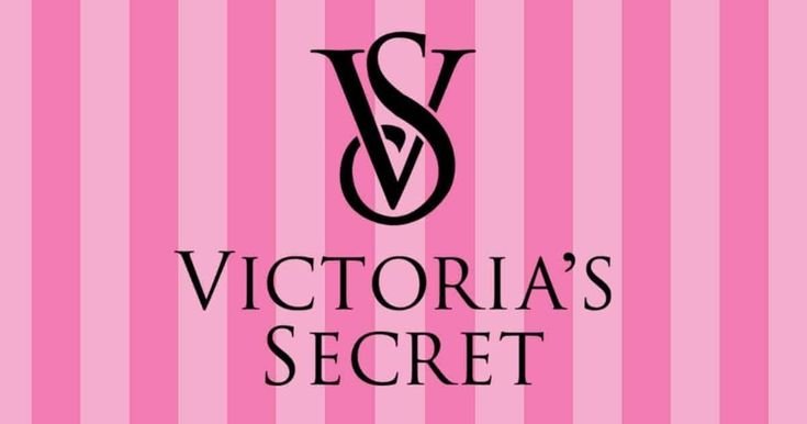
Brands like Barbie, Victoria’s Secret, Baskin-Robbins, T-Mobile, and Lyft use pink to create a strong emotional connection. Barbie’s bright pink branding reinforces its fun and feminine identity. Victoria’s Secret uses pink to symbolize sensuality and elegance. T-Mobile’s bold magenta differentiates it in the telecom industry.
Pink is best for brands that want to stand out with charm, energy, and vibrancy. Whether it’s Cosmopolitan’s bold pink typography or LG’s friendly branding, pink remains a striking and memorable choice.
Black Logos
Black represents power, elegance, and sophistication. It’s a timeless and versatile color that exudes authority and exclusivity. Psychologically, black is linked to strength, formality, and luxury. Many high-end brands use black to communicate prestige and minimalism.
Black is also associated with mystery and boldness. It provides a striking contrast when paired with other colors, making it ideal for luxury fashion, automobiles, and technology brands. Research indicates that black can create a sense of control and sophistication, which is why it’s widely used in corporate and luxury branding.
Brands like Apple, Nike, Chanel, Adidas, and Mercedes-Benz use black to signify premium quality and modernity. Apple’s sleek black branding represents simplicity and innovation. Nike’s black swoosh is iconic in its minimalism and power. Chanel and Prada use black to reinforce their status as luxury fashion icons. Mercedes-Benz’s black-and-silver logo reflects prestige and performance.
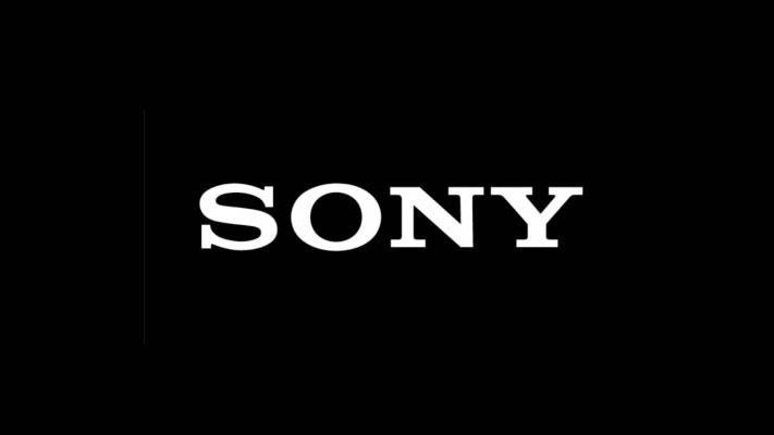
Black is perfect for brands that want to establish a sense of exclusivity and boldness. Whether it’s The New York Times evoking journalistic integrity or Sony representing innovation, black logos never go out of style.
White Logos
White represents purity, simplicity, and clarity. It’s often used in minimalist branding, symbolizing a clean and modern aesthetic. Psychologically, white is linked to neutrality and openness, making it a great choice for healthcare, technology, and lifestyle brands.
White can also evoke feelings of peace and balance. Many brands use it as a primary or secondary color to create a sleek and fresh look. It enhances readability and contrasts well with bold colors, making it a key element in branding.
Brands like Apple, Tesla, Adidas, The North Face, and Sony incorporate white to convey simplicity and futuristic appeal. Apple’s minimalist design philosophy aligns with its white branding. Tesla’s use of white represents innovation in sustainable technology. Adidas and The North Face utilize white to highlight their sleek, athletic appeal.
White is an ideal choice for brands that want to exude simplicity, clarity, and a modern touch. Whether it’s Wikipedia’s commitment to knowledge or Lego’s focus on creativity, white adds a timeless and clean aesthetic.
Gray Logos
Gray represents balance, neutrality, and sophistication. It is often associated with professionalism, timelessness, and modernity. Psychologically, gray evokes a sense of calmness, stability, and formality, making it a great choice for brands that want to appear sleek and dependable.
Gray is widely used in industries like technology, finance, automotive, and luxury fashion. It serves as a neutral and elegant color that allows other design elements to stand out without overpowering them.
Brands like Apple, Mercedes-Benz, Honda, Swarovski, and Wikipedia use gray to project refinement and simplicity. Apple’s gray logo aligns with its sleek and minimalist design philosophy. Mercedes-Benz’s silver-gray emblem conveys luxury and precision in the automotive industry. Wikipedia’s gray globe symbolizes knowledge and neutrality.
Gray works well for brands that want to appear modern, serious, and timeless. Whether it’s Nike’s iconic gray swoosh variations or Swarovski’s crystal elegance, gray remains a powerful and understated choice in logo design.
Brown Logos
Brown represents reliability, warmth, and authenticity. It is often associated with the earth, stability, and tradition. Psychologically, brown evokes a sense of wholesomeness and dependability, making it a great choice for brands that want to communicate trust and ruggedness.
Brown is frequently used in industries related to nature, agriculture, coffee, and craftsmanship. It signifies a down-to-earth and honest approach, which is why many brands in the food, beverage, and handmade goods sectors embrace it.
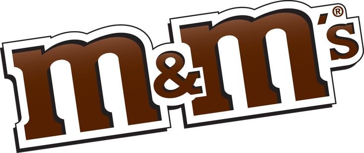
Brands like UPS, Hershey’s, M&M’s, Nespresso, and Louis Vuitton use brown to convey richness and dependability. UPS’s brown logo represents security and trust in logistics. Hershey’s and M&M’s use brown to highlight the indulgent, chocolatey nature of their products. Louis Vuitton’s brown monogram pattern reinforces timeless luxury and heritage.
Brown is ideal for brands that want to appear traditional, strong, and grounded. Whether it’s A&W Root Beer’s nostalgic branding or Cracker Barrel’s rustic appeal, brown creates a strong emotional connection.
Gold Logos
Gold symbolizes wealth, prestige, and success. It is often used to create an aura of luxury and exclusivity. Psychologically, gold is linked to achievement, sophistication, and grandeur, making it a preferred choice for high-end brands.
Gold is associated with elegance and high status. It is often paired with black or deep colors to enhance its luxurious effect. Studies suggest that gold can evoke feelings of prosperity and excellence, which is why it’s used in premium branding.
Brands like Rolex, Versace, Lamborghini, Moët & Chandon, and MGM use gold to highlight exclusivity and opulence. Rolex’s gold crown represents prestige in watchmaking. Versace’s gold Medusa logo signifies artistic excellence and high fashion. Lamborghini’s gold bull exudes power and performance.
Gold works best for brands that want to project sophistication and luxury. Whether it’s Chanel No. 5’s golden accents or Gold’s Gym’s strength-focused branding, this color carries a sense of success.
Silver Logos
Silver represents modernity, innovation, and sleekness. It is often associated with high-tech industries, automotive brands, and futuristic designs. Psychologically, silver evokes a sense of sophistication, intelligence, and cutting-edge technology.
Silver is widely used in the technology and automotive industries because it conveys precision and advancement. It is often combined with black, blue, or white to create a clean and professional look.
Brands like Apple, Mercedes-Benz, Audi, Sony, and Nikon use silver to communicate elegance and innovation. Apple’s silver logo aligns with its minimalist and modern design philosophy. Mercedes-Benz and Audi’s silver emblems reinforce their status as premium automobile brands. Sony’s silver branding reflects technological excellence.
Silver is an excellent choice for brands that want to appear high-tech, modern, and sleek. Whether it’s PlayStation’s futuristic branding or Olympic medals’ symbolism of achievement, silver remains a powerful and sophisticated color.
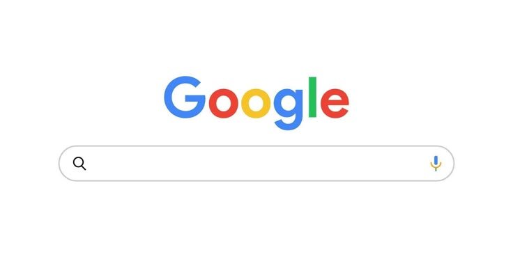
Multicolor Logos
Multicolor logos represent diversity, creativity, and inclusivity. They symbolize a brand’s dynamic and innovative nature. Psychologically, multicolor branding suggests openness, fun, and adaptability, making it a strong choice for global and tech-oriented companies.
Multicolor branding is often used by companies that want to appeal to a broad audience or emphasize their creative and innovative approach. It signifies limitless possibilities and vibrant energy.
Brands like Google, Microsoft, eBay, NBC, and Slack use multicolor to reflect diversity and playfulness. Google’s multicolor logo signifies its innovative and inclusive nature. Microsoft’s four-color squares represent its broad range of products. NBC’s colorful peacock reflects creativity in media and entertainment.
Multicolor works best for brands that want to showcase versatility and a forward-thinking mindset. Whether it’s Adobe’s Creative Cloud embracing creativity or Olympics’ five rings symbolizing unity, multicolor branding stands out in a dynamic way.
Why We Associate Colors with Feelings
Our association of colors with feelings is a complex interplay of biology, culture, and personal experience. From an evolutionary perspective, certain color responses are innate. For example, red’s association with danger and ripeness is deeply ingrained, triggering physiological responses that ensured survival. However, much of our color psychology is culturally learned. Societies assign symbolic meanings to colors, which are then reinforced through art, language, and tradition. Blue, for instance, often symbolizes trust and stability in Western cultures, while in some Eastern cultures, it can represent immortality. Furthermore, personal experiences shape our color preferences and emotional responses.
A childhood spent playing in sun-drenched fields might create a lifelong affinity for yellow, while a traumatic event might instill a negative association with a particular hue. These layers of influence—biological, cultural, and personal—create a rich tapestry of color associations, making color a powerful tool for evoking emotions and shaping perceptions.
How to Choose the Right Color for Your Brand
Selecting the right color for your brand logo is a strategic decision that requires careful consideration of your brand’s personality, target audience, and industry. Begin by defining your brand’s core values and the emotions you want to evoke. If you aim to project trust and reliability, blue might be a suitable choice. For a brand that emphasizes energy and passion, red could be more effective. Research your target audience’s color preferences and cultural associations, ensuring your color choice resonates with them. Analyze your competitors’ color palettes to identify opportunities for differentiation. Consider the context in which your logo will be used, ensuring it remains legible and impactful across various mediums.
Test your logo with your target audience to gather feedback and refine your color choices. Remember, color is a powerful communication tool, and selecting the right palette can significantly enhance your brand’s recognition and emotional connection with your audience.
The Psychological Impact: A Deeper Dive
The psychological impact of color extends far beyond surface-level associations. Colors can influence our cognitive processes, behavior, and even physiological responses. Studies have shown that blue light can enhance cognitive performance, while red light can increase heart rate and alertness. In marketing, colors are strategically used to influence purchasing decisions. Warm colors, such as red and orange, can create a sense of urgency and excitement, encouraging impulse buys. Cool colors, such as blue and green, can promote a sense of calm and trust, fostering long-term customer relationships. Furthermore, color can play a significant role in brand recall and recognition.
A distinctive color palette can make a brand instantly recognizable, even without its logo or name. Understanding these nuanced psychological effects allows brands to leverage color effectively, creating a powerful and memorable brand experience. By aligning color choices with brand values and target audience preferences, brands can create a lasting emotional connection that drives loyalty and advocacy.
Conclusion
In the realm of logo design, color is more than just a visual element; it’s a powerful psychological tool capable of shaping perceptions, evoking emotions, and forging lasting connections with your audience. By understanding the intricate language of color psychology and carefully selecting a palette that resonates with your brand’s identity and values, you can elevate your logo from a mere visual mark to a potent instrument of brand communication. Whether you seek to project trust, passion, or sophistication, the right colors can amplify your brand’s message and create a memorable, impactful presence in the marketplace. Master the chromatic code, and you’ll unlock the true potential of your brand’s visual identity.


Comments
This is my first time pay a quick visit at here and i am really happy to read everthing at one place
We’re so happy to have you here! 😊 It’s great to know your first visit was a positive one. We look forward to sharing more valuable content with you, welcome to the community!
— Team Amphin
I’m often to blogging and i really appreciate your content. The article has actually peaks my interest. I’m going to bookmark your web site and maintain checking for brand spanking new information.
Thank you so much for your kind words and support! We’re glad the article caught your interest. It means a lot to know you’ll be checking back, we’ll keep the valuable content coming!
— Team Amphin
I just like the helpful info you provide in your articles.
Thank you so much! We’re really glad to hear you find the information helpful. Your support encourages us to keep creating valuable content!
— Team Amphin